International Festival of Technology
Rebrand for the Technology festival of the Netherlands
For the International Festival of Technology we were asked to design the branding, motion and campaign for the festival - only keeping the logo and taglines as they were. The festival is a cooperation between the TU Delft, Gemeente Delft, Haagse Hogeschool, InHolland, Ondernemersfonds Delft, Fonds1818 and Discovery Channel. We designed the third edition of the festival, where the briefing was to really center on the playful vibe of 'technology, food, art, music' - IFOT being the place where it all comes together.
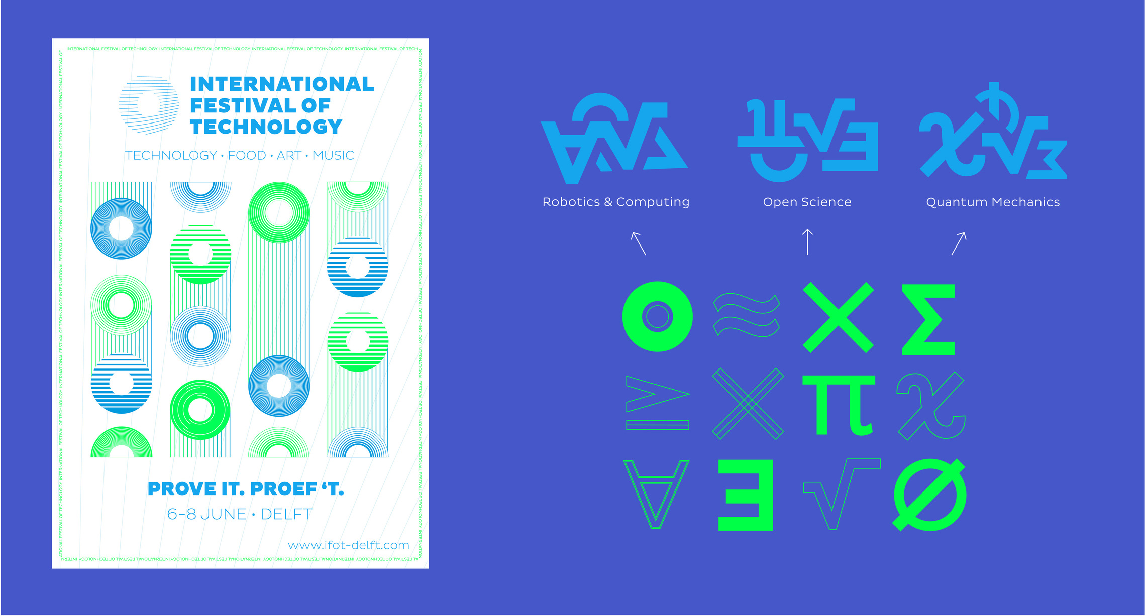
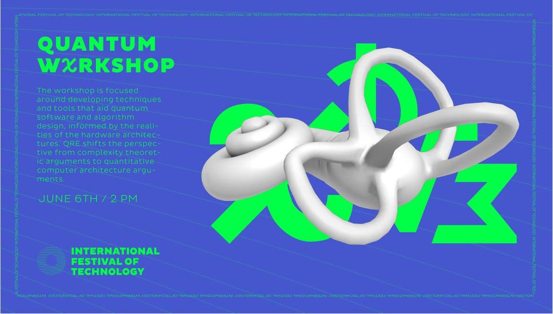
In the briefing we received a note of scientific icons, dividing them into three categories: quantum mechanics, robotics and open science. They were the three main workshops and also the head subjects for the festival. We also got some questions to go with the main subjects such as 'can we develop/improve senses with technology?' to 'how big is the influence of big data?' to give us a starting point for the design. We started with the icons, and merged them to their significant categories.
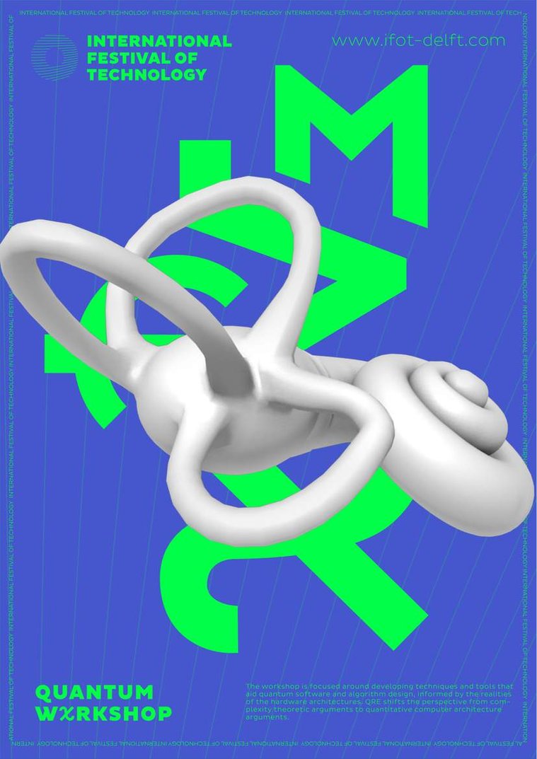
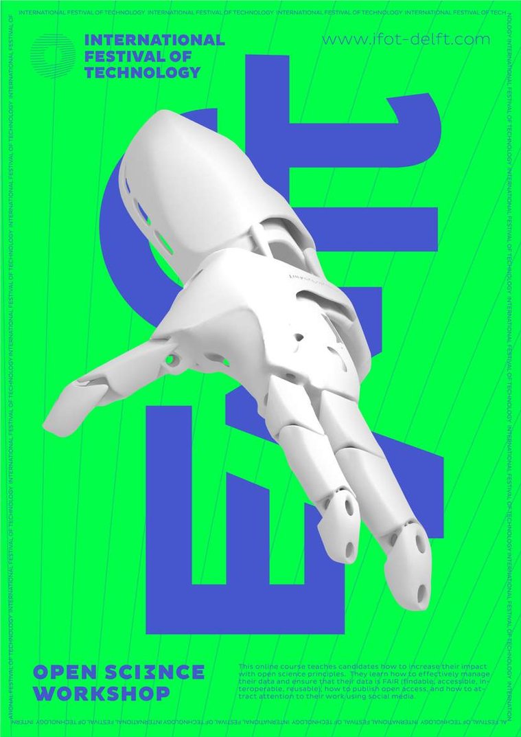
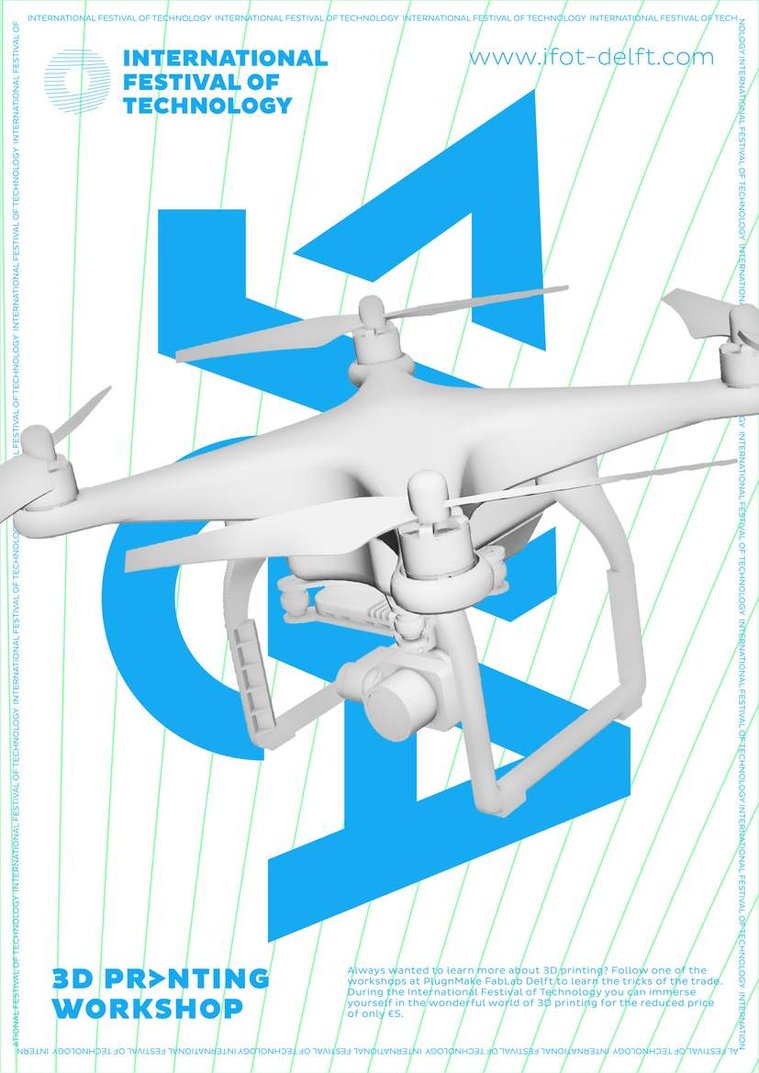
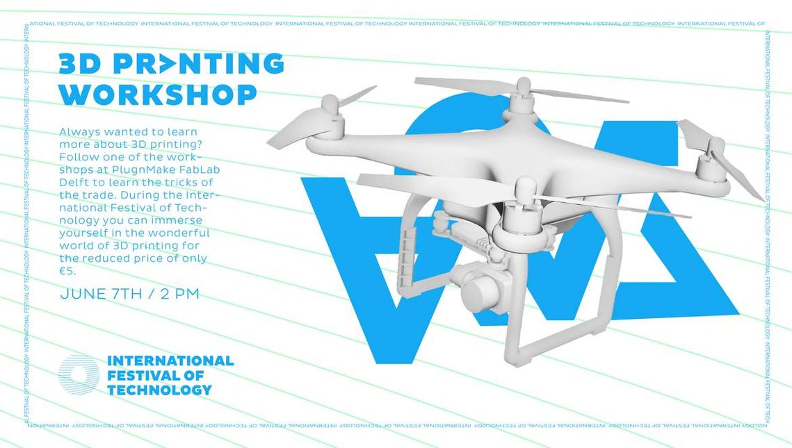
We chose to go with an minimalistic flat design in combination with overlaying 3d objects. The 3d objects are an extra representation of the three categories. The inner ear model belongs to the quantum workshop, which revolves around improving senses with technology, where the hand stands for the acces of big data with open science and the drone is a representation of robotics/circular economy with 3d printing and recycling. We also had one main poster, which is shown in the image underneath, representing the connections through different circles..
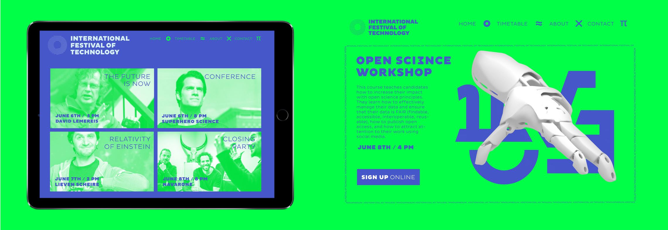
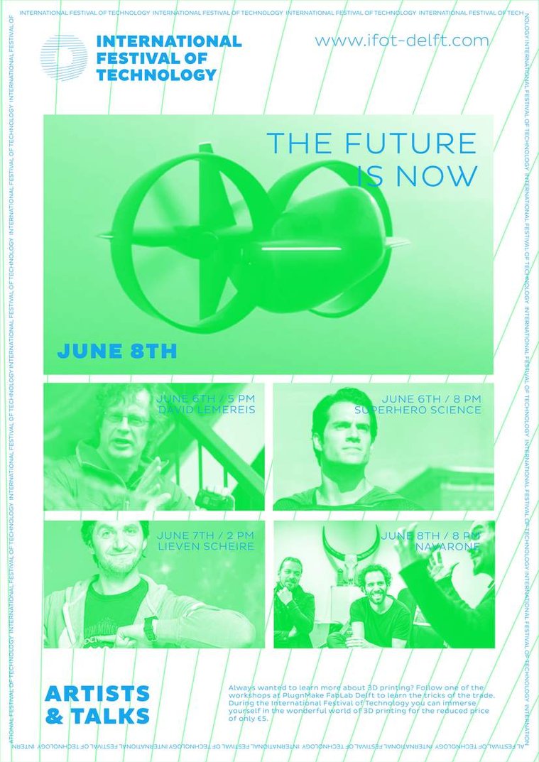
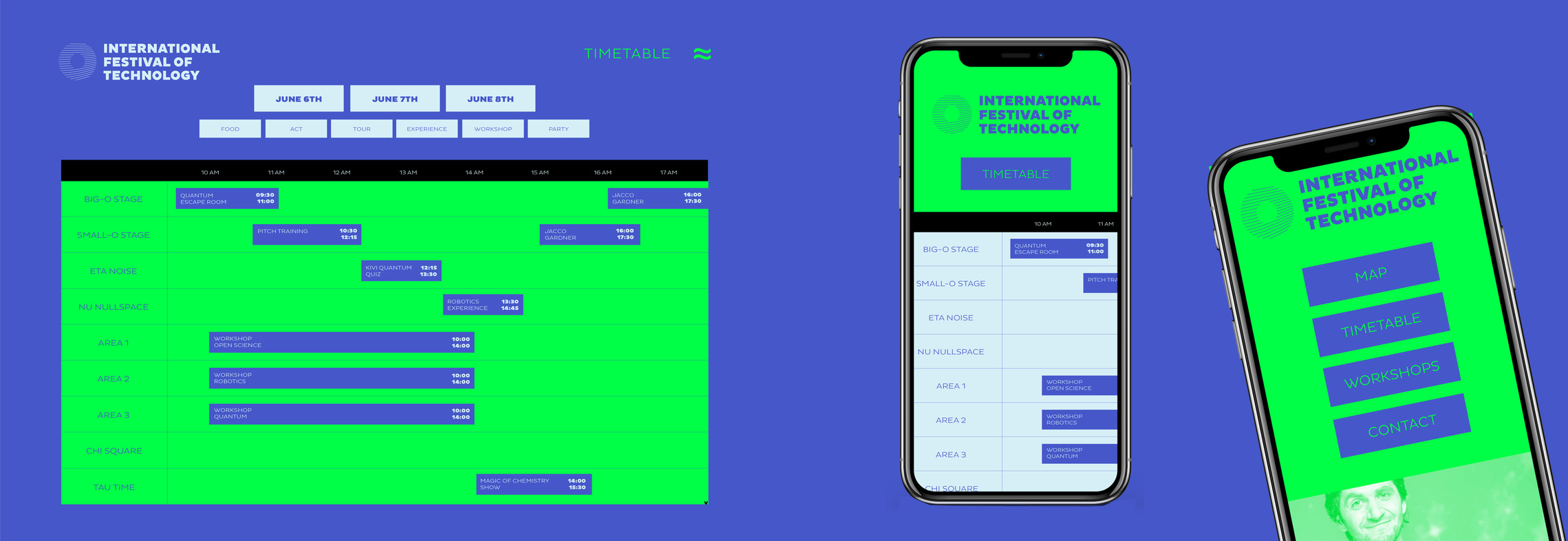
The web environment contains the timetable per day and an online registry page for the three main workshops. When focusing solely on the artists and speakers, the festival management felt to not combine these and instead wanted multiple designs made tho highlight these different sides of the festival. Here we chose to stay with the colours by giving them a duotone treatment, also to give the photos we received a little bit more spice. The posters could be folded and were given out as flyers to inform the guests of the highlight talks of that day.
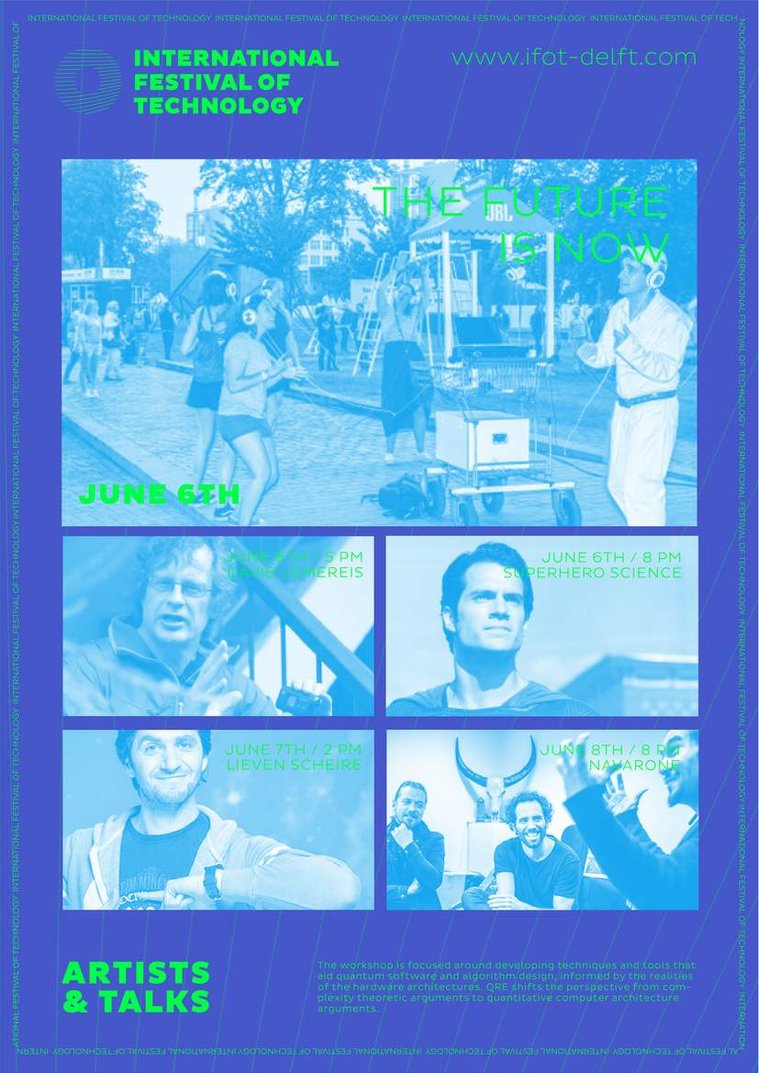
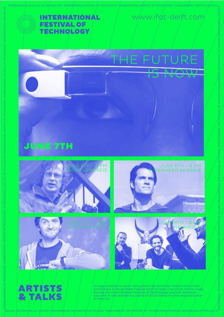
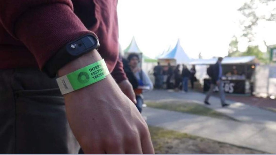
For the online teasers we chose to stay in the more generic environment, as we had on the main poster at the top. The circles stand once more for our different categories. For small branding aspects such as festival cards or wristband we also stayed with the use of our original icons, making that the voice of the festival.
Jorge Fröberg - Graphic & Motion Design
Camie Roos - Graphic & 3D Design