SPIKE Rebrand
Taking the brand to the dynamic design world it deserves
Two years earlier I was in the lead on the rebrand of SPIKE, at that time a relativily young channel focussing on a unique mix of (contact) sports and entertainment. We created a fresh contemporary look that was unmatched to the Dutch TV landscape. However, we had so much more in mind for the brand that never saw light of day due to time constraints. So this time around, we got a carte blanche to go all out on each level and truely give the brand its dynamic design world it deserves.
Shifting typography on steroids
One of the most unique design elements of the SPIKE brand has been our shifting typography. We were the first TV channel to use variabel and animating typography, now we've built on that feature and given it some steroids.
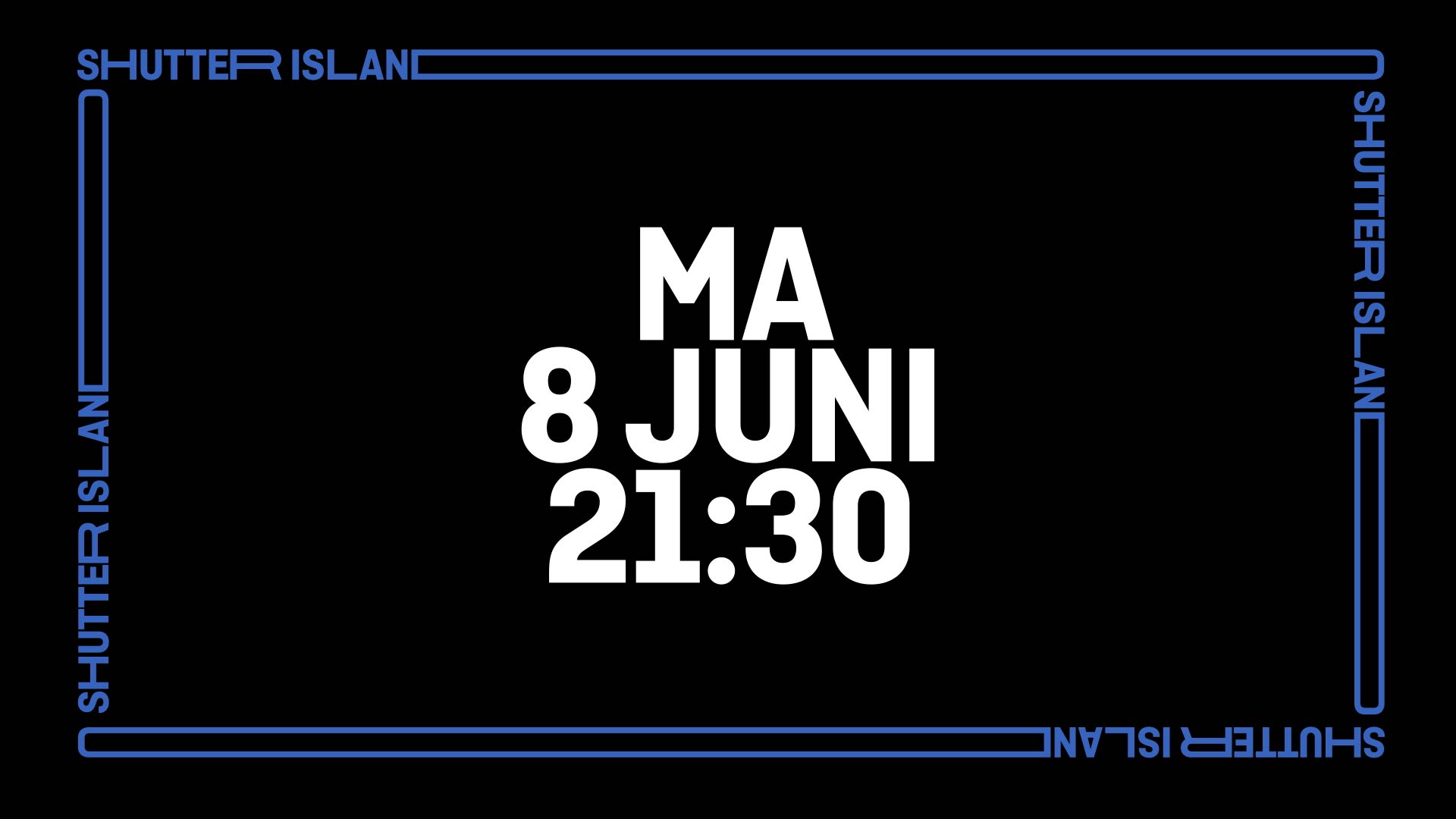
The frame sets our content center stage as it moves around it
The FRAME is a new design element we’ve introduced to the brand. This dynamic typography based element is always on the move, taking on different dimensions as it sets our talent and messaging center stage. Always consisting of a show title, it plays a big part in the new SPIKE look & feel.
All of these elements come together in our new promo graphics. Packed with shifting typography while still setting the content center stage, the promos rightfully tell the story of SPIKE.
Noesjka van der Helm - Head of Brands
Justin Queen - Project Manager
Jorge Fröberg - Art Director, Concept
Camie Roos - Graphic Design
Ivo Deumens - Motion Design